What exactly is meant by responsive websites?
The term “Responsive Web Design” has gained acceptance in the last decade and describes an approach to website design. The responsive character of the website is intended to ensure that the user of the site receives an optimal presentation of the content.
Responsive programming has become necessary because a steadily growing number of users access websites mainly with mobile devices such as smartphones or tablets. These have smaller displays than a laptop or desktop PC, for which websites were originally designed. These are not optimally displayed on smaller devices and considerably reduce user friendliness (usability).
How is the responsive character created?

The term “responsive” literally means that something is “answered”. In fact, when the user calls up a website, the server makes a preliminary enquiry. This determines with which end-user device and which browser the page is called up.
A responsively programmed website reacts to this response by ensuring that the page is optimised for the respective device. Aspects of the basic page structure, the control and even the content are influenced:
- The entire layout is constructed to fit the dimensions of the display or screen.
- If images are stored on the server, the optimal image size is selected to fit the end-user device.
- Instead of a fixed menu navigation in the upper screen area, there can be a hidden menu navigation which can be called up via the “hamburger symbol”.
- Supplementary content is only displayed when the dimensions of the screen or display reach a certain size.
Responsive design and web development
Responsive programming of websites has become an indispensable part of modern web development. This form of programming alone shows that the website operator is aware of the increased number of users using mobile devices and is responding to this with adapted website programming.
Responsive web development is often equated with optimising the website for smartphones. This is only partly correct. The end user’s choice of devices is wide and ranges from smartphones and tablets to iPhones and iPads, netbooks, notebooks and large screens used in the B2B environment.
With all these devices, the user wants to rely on an optimal display of the page content and a menu navigation adapted to the device. In web development, this is realised by creating different layouts of the website, which are created for certain intervals of pixels in length and width.
Why is the Google ranking at risk?
Without top rankings on Google or Bing, it becomes difficult for any site operator to be found in the digital world. Many operators are not aware that they actively jeopardise an achieved ranking if they decide against a responsive presentation in web development.
The reason for this is simple: a website that has not yet been developed according to the standards of responsive design is many years old. Google and other search engines conclude from this that the site operator does not care about the maintenance of the site. Even if the content is constantly updated, the website does not meet modern requirements in terms of form and design.
Since Google has placed increasing emphasis on the mobile character in its search algorithm, older pages without responsive programming lose their rankings. These can even be completely removed from the search index of Google and other search engines, as they no longer meet the standards of today’s internet. This is the worst case scenario that every website operator should avoid.
Responsive programming and SEO
Closely linked to good Google rankings are search engine optimisation (SEO) measures that every committed site operator should implement. SEO measures from the early days of the Internet are often thought of here, for example good backlinks or texts with relevant keywords.
These simple SEO measures have lost none of their importance. Countless criteria have long since been added that are just as important to Google in terms of the added value and quality of a website. A cleanly programmed source code and responsive design are among them.
It is therefore useless to invest a lot of money in optimising the content of a page if form and design fall by the wayside. Only those who do their homework in web development and optimise their site on a technical level will be able to build on this with strong content.
How an online marketing agency can help
Due to the close connection of Responsive Web Design with the topic of SEO, every marketing agency is familiar with this topic. Agencies like ONELINE therefore focus on a holistic approach when it comes to website design. Web development, web design and content equally characterise a modern web presence and should always be offered by an agency as a complete service.
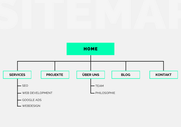
For customers of ONELINE, it is therefore important to choose several coordinated services when realising a new web project. Among other things, these service areas are covered:
For the realisation of websites, ONELINE relies on content management systems such as Magento or WordPress. The advantage of these systems: The responsive structure is applied automatically and provides the security that the new website meets the required standards.
Switch to Responsive Web Design today
As an operator of older websites, you should realise that you web presence quickly becomes daunting and no longer shows up in Google search results. ONELINE helps you to prevent this and gives your online presence new momentum with contemporary web development. Get in touch with ONELINE today! With us you will experience how responsive programming will convince the human viewer with all end user devices and search engines like Google!


