
Mobile Internet use is growing steadily. For the first time in 2016, it exceeded stationary use worldwide, which, by the way, is due to many users in African and Asian countries who do not purchase a stationary PC at all. Here are just a few facts:
- In the Philippines, mobile usage in 2019 averaged 311 minutes per day.
- In Thailand it was 297 minutes
- Nigeria: 290 minutes
- Kenya: 276 minutes
- USA: 162 minutes
- Austria: 139 minutes
- Switzerland: 132 minutes
- Germany: 112 minutes
When Google observed this development, the company’s management announced that the focus would now be on mobile users. This means that websites that are especially optimized for mobile use via Responsive Web Design will receive a better ranking. Google had already adapted its own search algorithm to the increasing mobile use in 2015. Since then, the search engine giant has been prioritizing mobile-optimized pages more and more. This trend continues to this day – as of March 2020. Since the last Google update, we can even claim with certainty that the mobile user and thus the mobile responsive website is prioritized compared to the desktop user.
What is a mobile responsive website?
Such websites recognise which end device is calling them up – a desktop PC, a smartphone or a tablet. They then open adapted to this website. This is achieved in the technical design through the correct use of CSS and media queries. As a user, you don’t have to understand this in detail, it is only intended to give a brief indication of the technical principle. We already know this from many websites: They look completely different on a smartphone than on a desktop PC. Among other things, pictures that otherwise fill the start screen are not necessarily displayed in full screen mode. The arrangement of the subpages is done in a different, smartphone-friendly way. Pictures open according to a different technical principle (from fuzzy to sharp), which reduces the amount of data required. There are even more details that we as an online marketing agency pay attention to when designing a website responsively. They all serve to improve the presentation on mobile devices.
10 reasons for a mobile responsive website
A website is not automatically optimised for mobile use from the outset. As an online marketing agency, we have to clear up this mistake with our customers time and again. They are of the opinion that if the website can be called up with a smartphone – even if it is by entering the URL – it is still suitable for mobile devices. But this is not the case. Without the use of Responsive Web Design, the page will appear very unfriendly on the small display of the smartphone and will therefore be abandoned quickly. Among other things, this has a very negative influence on search engine optimization (SEO). But with some additional design work we optimize your page(s) for mobile devices. These 10 reasons speak for it:
1. SEO
Through mobile, responsive design, you will receive a better rank in the search results and additionally gain more users or customers. Mobile devices – especially the smartphone – are used by people everywhere today. Not only in public transport, libraries or parks, but also at home, we often reach for a smartphone for a search much faster than turning on the PC. We use the mobile device to search for information, the location of the nearest hotel or restaurant and a doctor, we shop with it and communicate eagerly with our smartphones. But we only visit the websites that we find in the front ranks. These are the responsive pages.
2. Credibility
A mobile responsive website inspires trust and makes you credible with your customers, business partners and influencers. If you realize that your site is optimized for mobile devices, you will have a positive experience. If the site is not optimized for the smartphone, however, it creates frustration. Stay a credible resource for products, information and services through responsive design.
3. Best practice as standard
Initially, responsive design for mobile devices was only considered best practice, but it has now become the standard. In the meantime, the majority of all websites worldwide have a mobile-friendly design. New websites are practically only set up in this way; even homepage construction kits offer responsive design from the outset. In view of the extensive mobile Internet use, this is also a matter of course (see above), which is why you absolutely have to follow this trend. Your users are counting on it. They are now used to this standard on most websites.
4. More customers
You will win considerably more customers much faster. All those interested in your products and services, who conduct their searches predominantly on the move, practically only call up pages optimised for mobile use. Without a responsive design, your site will rank very poorly in mobile searches, even if it still appears relatively far ahead on the desktop PC. This would render many of your SEO efforts useless. It is very rare for a prospective customer to search for your company on the smartphone, and even less often they enter your URL. Therefore there is no way around responsive design for companies that want to sell on the net.
5. More turnover
You also generate more revenue per customer with a responsively designed website. The customer can simply orientate himself much better on it with the smartphone and naturally buys more due to this user experience. They find the things they were really looking for. In addition: The satisfied customer returns to your site and buys even more in the future. In the best case he shares the site with other people, which can exponentially accelerate your business. On the other hand, a frustrated customer you leave with a site that is not mobile-optimized could, on the contrary, write a negative review about you.
6. Reward through Google
As already communicated at the beginning, Google rewards mobile optimized websites with a better ranking. Today, every webmaster knows the relevant recommendations of Google and acts accordingly if he acts wisely. Since 2015, those responsible at Google have repeatedly pointed out how important optimization with a responsive design is for mobile devices. It was the time when the revolution of smartphones could no longer be ignored.
7. Visual improvement of your web presence
Mobile optimized pages look much better on the smartphone. Of course, they also work well there if we have used responsive design for you. So it’s not worthwhile to go back to the outdated former way of design only for the PC. That would even be a business risk.
8. Enhancing your reputation
If you follow the modern technical trend towards responsive design, this will significantly strengthen your reputation on the net. This applies to the online area, of course, but even offline it’s better to talk about you because you’re optimally presented on all devices on the net. People are happy to report about the companies they have had good experiences with. So it could be that a customer who has bought fashion from you tells her friends at a coffee party. All these ladies know nothing about the background of responsive design. The first shopper only reports that she was very satisfied with the shopping she did with her smartphone – and immediately shares your website with the entire coffee group.
9. Modern and relevant appearance of your company
They can sell the best products and services we can imagine – without a modern web presence, they appear dusty and old-fashioned, in the worst case even useless and irrelevant. This is related to the above mentioned point that today, responsive design has left the status of best practice and has become standard. Those who do not optimise their sites in this way must be considered old-fashioned. On the other hand, those who rely on it are among the modern, innovative and therefore relevant companies. Such companies reach every smartphone user today, which (almost) means that they reach everyone.
10. Better functionality
Websites that are not optimized for mobile use also work worse. Just imagine if someone wanted to search your sitemap for links on the tiny smartphone display. He probably turns away frustrated. Our digital landscape is evolving faster and faster. Only those who keep up with the times can stay ahead of the fierce competition. Websites that are not responsively designed could soon disappear from the scene all together.
How do we create a mobile optimized site for you as an online marketing agency?
The reasons for the mobile optimized site should now be clear. You are now asking yourself how we proceed. There are five main focuses:
- 1. Restriction of pop-ups: A pop-up certainly fulfils its function, but if the user does not want to see it, he must be able to hide it very quickly. This is very easy on the desktop PC with a click, but not on the smartphone. But mobile users are always in a hurry. We recommend that you strongly restrict pop-ups on mobile sites or avoid them altogether. Google calls these ads “interstitials” and punishes pages with a poor ranking if these interstitials affect the user experience.
- 2. Percentages for width: With CSS stylesheets allow you to define the width of elements on the page as a percentage. This affects columns and images. A pixel definition is also possible, but we like the percentage approach better. For example, a setting of 50 percent ensures that the user does not have to scroll horizontally. The pixel setting sometimes results in unfavorable sizes.
- 3. Media queries: The media queries ensure that your site recognizes the calling device (as mentioned at the beginning). They are one of the pillars of responsive design. This means that you only need one web page that always opens in a way that is adapted to the device. It can display large images and intricate graphics on the desktop PC, but not on the smartphone. To do this, the page must know which device it is calling up. Media queries provide this “knowledge”.
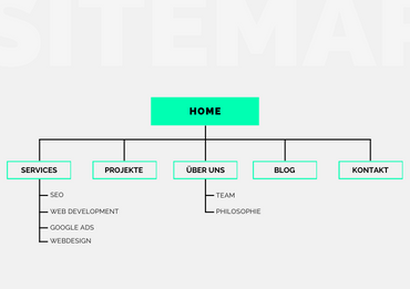
- 4. Avoid distractions: On the smartphone, it is extremely important that the user is led to where the desired information can be found in a flash. The colourful pictures and fade-ins of the pages for the desktop PC can be counterproductive here. We make sure that pages optimised for mobile use contain little distraction. We have moved the sitemap to the bottom margin for better clarity.
- 5. AMPs: The Accelerated Mobile Pages work via a special framework for improving the loading speed. Google is very committed to the use of AMPs. We therefore also use them for the responsive design and have achieved very good results so far. Pages with AMPs apparently rank better on Google, according to a current SEO hypothesis.
Start Responsive Webdesign now!
If your site is not yet mobile optimized, let us start this project now! The mobile optimization will increase your success on the net very significantly. If you order a new site from us, we will optimize it for mobile devices from the beginning.
Please feel free to contact us! Our team of online marketing specialists is ready to help you with words and deeds!